| Daisy POPFile - Tuning - Improving the Analysis |
Once the Daisy Chart has been drawn, you can start to look for ways to improve how to classify your messages.
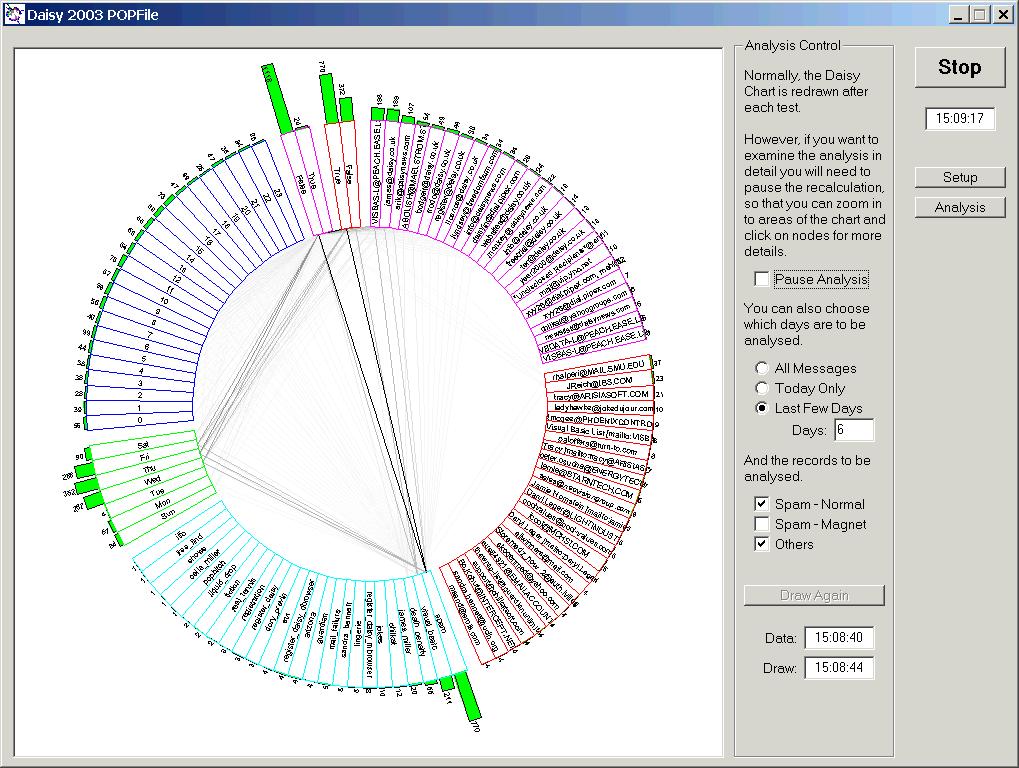
In the figure two classes of messages are shown; 'spam' and genuine ones, over a period stretching back six days.
Note that 'spam_magnet' messages are not shown, as you will generally be happy that these are 100 %-pure , unadulterated rubbish or even filth. These should be analysed occasionally, when you want to check that you have the 'magnets' right!
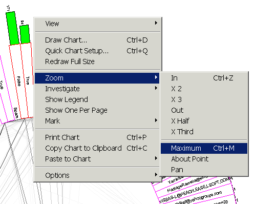
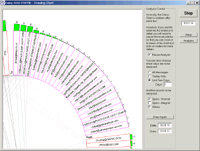
Before you can investigate the Daisy Chart you must check the 'Pause Analysis' box.
This enables zooming and viewing of the records in the chart.
It also enables the right click menu in the chart, which can be used to modify the analysis.